|
|
There are many ways to get ahold of us. You can call us at (786) 715-3915. You can click hereto send us an email.
There are many ways to get in touch with us. You can call us at (786) 416-0849 or email: info@foiltekprinting.com |
|
|
Our online ordering system accepts jpeg files (.jpg) or zip files (.zip)
You can also email us your files in the following formats: .pdf, .jpg, .eps, .psd, .tiff, .ai and .png
|
|
|
If you send us an RGB file, there is a chance that a color shift may occur and you may not be satisfied with your job

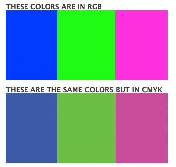
This is what RGB colors looks like on web.
Since the press machines cannot reproduce RGB colors, it uses the CMYK color system

This is what the same RGB colors looks like when they have been converted to CMYK for printing purposes. you should always start and finish your design sin CMYK color mode.
All print jobs must be in CMYK Color mode, if you send us an RGB File, there is a change that a color shift may occur and you may not be satisfied with your job.

You should always start and finish your designs in CMYK Color mode.
|
|
|
Print files should always be a MINIMUM of 300dpi (dots per inch)
This is a high resolution (300dpi) file. This is the same file but only at 72 dpi. See the difference?
 
For printing we only accept 300 dpi files and no less. |
|
|
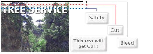
Bleed must extend further than the cut line. Using one of our templates can help you visualize this. Please keep all text and anything you do not want cut at least .125" away from the cut line.

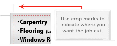
When sending an .eps or .pdf, make sure you include crop marks so we can cut the job correctly.

Bleed must extend further than the cut line and will be trimmed from the product during the final cutting phase. When the image is required to extend all the way to the edge, bleed is needed to preserve the finished look and the quality of the final product. Please keep all text at least 0.125" inside the cut-line. We recommend using our templates at all times. |
|
|
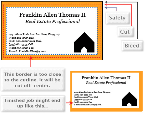
Yes, but if the border is too close to the cutline or is too thin, it may be cut off-center slightly.

We cut through many sheets at a time, so watch your borders to avoid an unwanted mistake.
Yes, but if the border is too close to the cut-line, it may be cut off-center slightly. We cut through many sheets at a time, so watch your borders to avoid an unwanted mistake. |
|
|
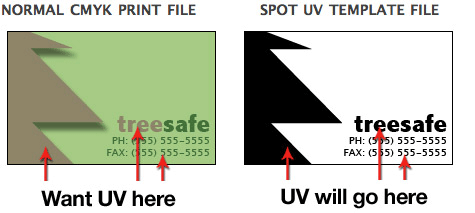
When creating a Spot UV job, you must also include a Spot UV template file along with the regular full color file.

Use 100% K to indicate where you would like the UV. White will indicate no UV.
REMEMBER "IF BLACK IS UV, IF WHITE NO UV!"
You must include a Spot UV template file along with the regular print file. The Spot UV template file is used to show where the UV coating needs to be applied. For better quality we recommend creating mask files in vector based programs. Please only use solid 100% K (black) to indicated where you would live the UV. Do not use shadows, glows or gray-scale images. White will indicate no UV. |
|
|
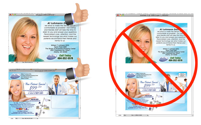
No. Each side of the job needs to be on a seperate file.

No, please separate your files. 1 File for the front and 1 File for the back. |
|
|
When sending artwork, do not send extra files, like proofs or samples, because they might get printed. ONLY send the files you need printed. DO NOT SEND THESE KINDS OF FILES

When sending your artwork, do not send extra files, like proof or samples, because they might get printed. Only send the files you need printed. |
|
|
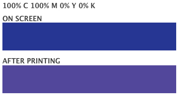
When using a blue in your design, always make sure to leave at least a 30% difference in your Cyan and Magenta values. Blue is close to purple in the CMYK spectrum. Remember, use a low amount of magenta whenever using high amounts of Cyan to avoid purple.

When using a blue in your design, always make sure to leave at least a 30% difference in your Cyan and Magenta values. Blue is close to purple in the CMYK spectrum. Remember, use a low amount of magenta whenever using high amounts of cyan to avoid purple. |
|
|
FOIL FILE PREPARATION
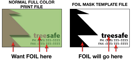
With Foil, you can turn a wide range of CMYK colors, into multi-colored Foils. Foil uses a special processed foil system that is applied under 4/c process to create an array of foil colors. It's simple, affordable, and makes your prints stand out from the crowd. For a Foil job, you must include a Foil/mask file along with your CMYK file. The mask file indicates where the foil will be placed. The file process is the same as spot UV—100% K where foil is placed, 0% where the foil is not placed.

As shown above, the file on the left is the normal CMYK print file. If you want the logo to be Foil, then your Foil mask file should look like the file on the right. The White indicates no foil and 100% K indicates where the Foil will be.
Here are some more things to keep in mind when creating your Foil artwork:
• - Make sure the mask and CMYK print file are aligned and match up properly.
• - Foil works best on lighter colors. The darker the CMYK color, the less the Foil look.
• - White in the CMYK file that is 100% K in the Foil file will appear as plain silver Foil.
• - Do not use very thin or small text and artwork with Foil... Use san serif fonts above 12 point for best results.
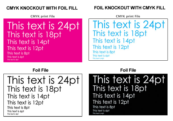
When creating knockouts in the Foil mask or in the CMYK print file, beware there might be a "Halo" of white around the knockout area. Below are two examples... On the left, a file with a CMYK magenta background with a knockout for the Foil text. On the right, a Foil background with a knockout for the CMYK text.

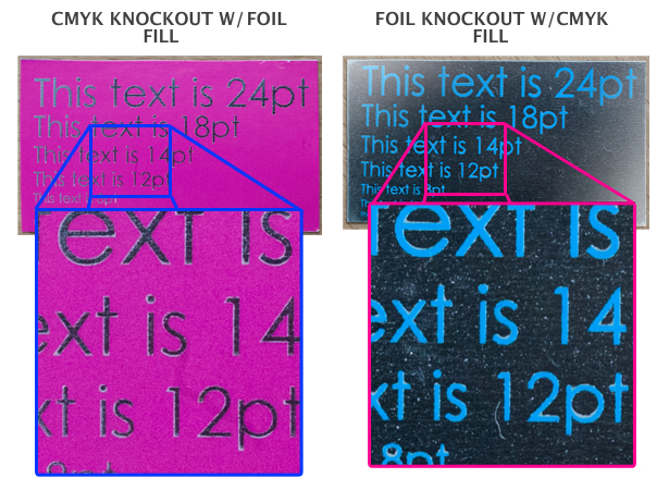
These are the printed results:

You can see the white "Halo" in-between the CMYK ink and the Foil. To prevent this, grow/stroke the Foil area in the mask by 1–2 pixels. This will allow the Foil to bleed into the CMYK area, reducing the white "Halo" effect.
Foil print jobs are set up the same as Spot UV files, You must provide a separate Foil mask file: black in the areas you want the foil and white in the areas you do not want the foil. All black areas should be solid 100% K with no other added colors. Avoid using small fine text or lines for foil objects. For best results make sure that foil coverage is less than 50% of the entire print side. Also be aware that there may be up to a 1/16" shift on the placement of the foil. Keep this in mind if you are trying to align foil with other printed artwork on the card. For better quality we recommend creating mask files in vector-based programs. |
|
|
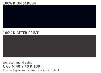
Rich black is an ink mixture of solid black, 100%K, with additional CMY ink values. This results in a darker tone than black ink alone. If you print black alone as 100%K, the resulting black may not be as dark as you might like.

Rich black is a ink mixture of solid black, 100% K, with additional CMY ink values. This results in a darker tone than black ink alone. If you print black alone as 100% K, the resulting black may not be as dark as you might like. We recommend using C:60, M:40, Y:40, K:100 this will give you a deep, dark rich black. |
|
|
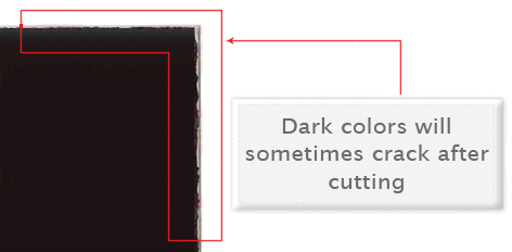
Cracking of the edges of a business card sometimes occurs when the card contains high values of ink, as in dark colors. This usually happens on a small amount of cards in the run. to prevent this, use lighter colors or if you must use dark colors, use as little as possible.

Cracking of the edges of a business card sometimes occurs when the card contains high values of ink, as in dark colors. This usually happens on a small amount of cards in the run. To prevent this, use lighter colors or if you must use dark colors, use as little ink as possible. |
|
|
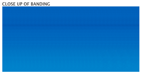
Many things can cause banding. Banding can be caused by the program that it is exported from, such as Indesign or Corel. Also, too many gradient steps, for example going from a very light color to a dark color, in a small are will cause banding.

To prevent this, check your digital files before sending. If you use a gradient, make sure it has enough room for a smooth transition.
May things can cause banding, it can be caused by the program that it is exported from. Also, too many gradient steps, for example going from a very light color to a dark color, in a small area will cause banding. To prevent this, check your digital files before sending. If you sue a gradient, make sure it has enough room for a smooth transition. |
|
|
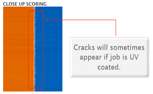
When a job is coated with UV then scored and folded the job may begin to crack. During use, the crack will become bigger and the ink may start to chip off. Cracking is normal when coated jobs are scored and folded. Ordering the job without UV will help but may not prevent this. As the job is used and folded more and more, cracking will eventually happen.

When a job is coated with UV then scored and folded the job may begin to crack. During use, the cracks will become bigger and the ink may start to chip off. Cracking is normal when coated jobs are scored and folded. |
|
|
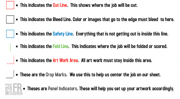
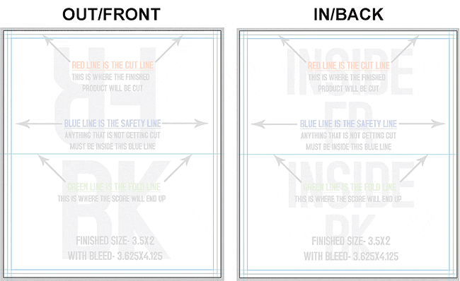
Our certified templates are a great tool to create artwork that can be printed faster, easier, and more accurately. Below is what each of the lines mean inside the template.

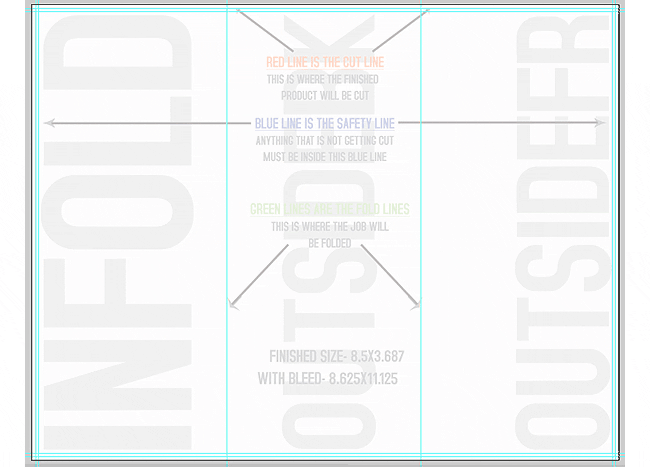
Here is what an 8.5x11 trifold brochure template looks like:

These templates will help you identify where the cut line, bleed line, and safety line, are located along with other information so you can design your art correctly. Some of our templates are labeled as OUT and IN. This means that there is some folding involved with the template. OUT means the FRONT of the job and IN means the BACK. During the upload part of your order, remember that OUT is the FRONT and IN is the BACK. Here is an example of the fold-over template.

As you can see, OUT is the FRONT of the job and after folding, will be facing outward. You can also see the rotation of the job. The front must be positioned upside down so it can fold correctly. Remember, DO NOT move or change any part of the template when using them.
Our certified templates are a great tool to create artwork that can be printed faster, easier and more accurately. These templates will help you identify where the cut line, bleed line, and safety line are located along with other information so you can design you artwork correctly. |
|
|
When designing plastic it is important to keep in mind that the frosted and clear plastic cards are transparent. Also, all plastic cards come with round corners at no extra charge!

As you can see, the difference in the transparency is shown in teh image above. The clear cards (right) are completely transparent. The frosted cards (center) are semi-transparent and cannot be seen through easily. The opaque white plastic cards (left) are solid white and not transparent at all. Keep this in mind when designing your plastic cards. it will affect how your design will print.

Since there is no white ink in CMYK, it is important to keep in mind that the frosted and clear plastic cards are transparent. The three designs above are the same as in the first picture. You will notice that the white are in the clear cards (right) and the frosted cards (center) has no ink and will show the transparent material it's printed on. In this case, the clear cards and frosted cards white area show up with no ink on the printed piece. Also, keep in mind that all colors that are printed on clear cards or frosted cards will be transparent as well.
With the clear plastic cards, there might be a small percentage that may have light scratches. This issue originates from the manufacturer and is due to the material and handling. To help compensate for this, we run overs of the clear plastic cards to help meet the required quantity.
Clear plastic cards will come with a thin protective layer on one side that can be peeled off. This is to prevent the cards from scratching during packaging and shipping.
When designing plastic cards, it is important to keep in mind that the frosted and clear plastic cards are transparent. Also, all plastic cards come with round corners at no extra charge. The clear cards are completely transparent. The frosted cards are semi-transparent and cannot be seen through easily. The opaque white plastic cards are solid white and not transparent at all. Keep this in mind when designing your plastic cards. |


